By Nicholas Pagonis
Finishing the UX Launch Kit was one challenge. Figuring out how to convince someone that it is worth buying has been a completely different one.
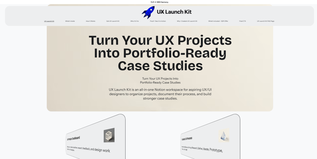
This week, I started developing the sales page for UX Launch Kit in Wix. My first instinct was to focus heavily on the visual design. I created a large hero section, feature cards, project examples, and other sections that made the website feel polished and professional. As I continued working on it, however, I realized that a good looking website and an effective sales page are not necessarily the same thing.
That realization changed how I approached the page.
Instead of treating the website like a portfolio, I started thinking about the experience from a potential customer’s perspective. Someone visiting the page needs to understand very quickly what UX Launch Kit is, who it is for, what problem it solves, and what they will actually receive. My headline, “Turn Your UX Projects Into Portfolio Ready Case Studies,” became an important part of that strategy because it focuses on the outcome rather than simply describing the product.
I also realized how important it is to actually show the product. Since UX Launch Kit is a Notion workspace, screenshots of the dashboard, UX project template, design process, and Case Study Builder communicate much more than abstract graphics. My next step is replacing some of the more generic visuals on the page with screenshots and mockups of the real product. This should make the sales page feel more trustworthy while giving potential customers a better understanding of what they are buying.
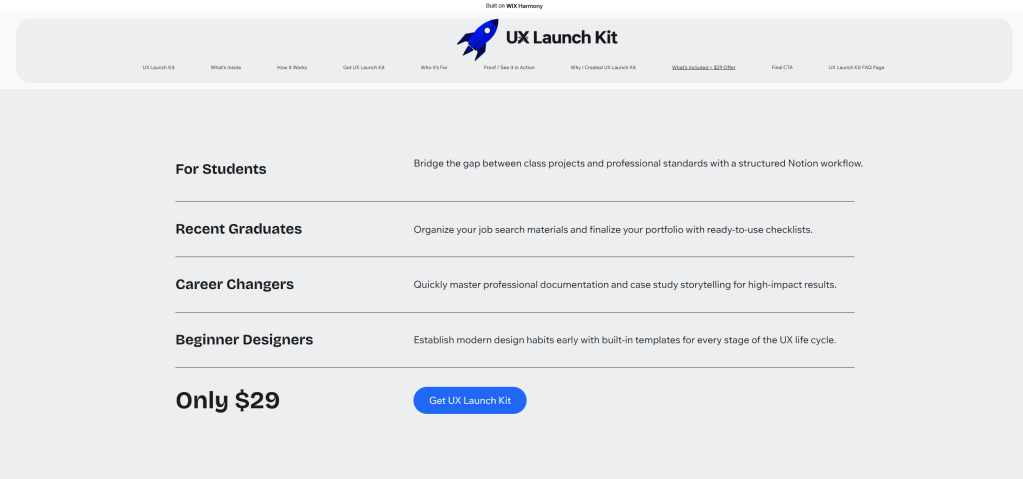
Pricing was another important decision. I decided to position UX Launch Kit at $29 as a one time purchase. I wanted the price to remain accessible for the main audience of UX/UI students, recent graduates, career changers, and beginner designers. At the same time, the product includes more than a single template. It combines project organization, a guided UX process, research documentation, a Case Study Builder, portfolio checklists, and additional resources into one reusable workspace. Because users can duplicate the system for future projects, I felt that $29 represented a reasonable balance between accessibility and value.
One of the biggest things I learned this week was how much sales strategy connects to customer psychology. A customer isn’t necessarily buying a Notion dashboard because they want another template. They are buying the outcome they believe that template can help them achieve. In this case, that outcome is moving from scattered UX work to an organized project and eventually a portfolio ready case study. This changed the way I wrote feature descriptions. Instead of simply saying that the product includes a Case Study Builder, for example, I can explain that it gives users a structure so they don’t have to start with a blank page.
The professional sales page for the Design Thinking Dashboard influenced this approach because it demonstrates the product visually while explaining its benefits and intended audience. I also looked at Notion’s template marketplace to see how digital workspace products are presented to potential users.
My biggest takeaway this week is that selling a digital product is really about clarity and trust. The sales page doesn’t need to make the biggest promises. It needs to help the right customer quickly understand the problem, see the solution, and decide whether UX Launch Kit is right for them.


Leave a comment