By Nicholas Pagonis

Research on user experience is most useful when it results in significant enhancements for actual users. The Barebells website had a thorough UX study during this project to see how well it serves users who are attempting to browse products, learn about nutrition, and eventually buy protein bars.
The final report is the result of several research techniques, such as structural analysis, usability testing, and user studies. This blog post describes the project from beginning to end, including the issue, the research techniques employed, the major findings, and the workable solutions that resulted.
Instead of just criticizing a website, the objective was to find practical ways to make it more user-friendly, effective, and in line with contemporary user expectations.
Project Background and Objectives
The Barebells website is as a marketing and educational center for the company’s range of protein bars and snack items. Product flavors, nutritional data, and the company’s brand narrative are highlighted on the website.
The website seems visually appealing and consistent with the brand at first glance. The whole design captures the vibrant personality associated with the Barebells brand, and the product imagery is engaging. excellent usability is not, however, a prerequisite for excellent visual design.
This project’s main objective was to respond to a crucial query:
How well does the Barebells website assist consumers who wish to research items and make judgments about what to buy?
A number of UX research techniques were used to examine the website from many angles in order to provide a response to that query.
Research Methods Used
This project’s usage of several complimentary UX research methods was one of its strong points. Different insights regarding how users engage with the site were provided by each method.
The research included:
- Competitor analysis
- Personas and user scenarios
- User interviews
- Online surveys
- Card sorting exercises
- Diary studies
- Heuristic evaluation
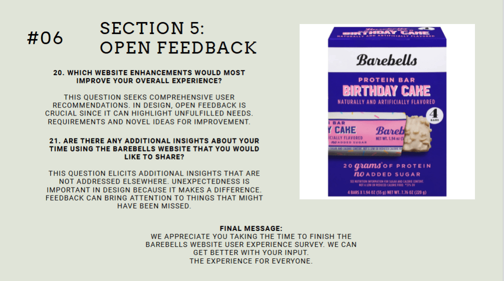
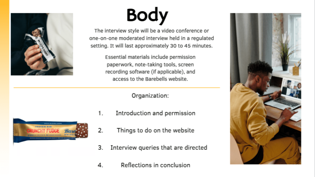
- Moderated usability testing
Using many approaches made it possible for patterns to recur in various datasets. When the same concerns surfaced in usability tests, surveys, and interviews, it was clear that those problems were actual usability issues rather than isolated viewpoints.
Understanding the Audience
The study concentrated on identifying the website’s target audience before assessing the design itself.
There were three main categories of users found:
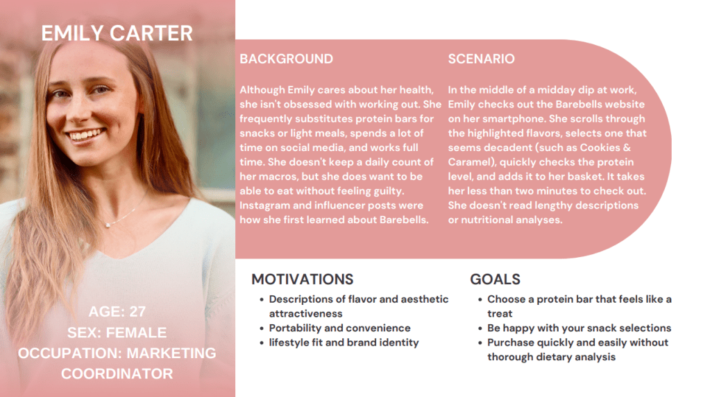
The Fitness Enthusiast
To aid in training and recuperation, this user deliberately looks for foods high in protein. They give priority to nutritional data, including calories, sugar, and protein content.
The Health-Conscious Consumer
Before making a purchase, this customer thoroughly compares snack products and frequently assesses several brands.
The Casual Snack Buyer
This person is looking for quick snacks and may not be familiar with the Barebells brand.
Although the motivations and behaviors of each character varied, they all had the same need: easy access to clear product information and convenient ways to make purchases.
What the Research Revealed
A number of recurring topics surfaced from usability testing, surveys, and interviews.
The Barebells website is visually appealing, but it doesn’t always facilitate effective task completion.
A number of usability issues kept coming up.
Issue #1: Purchasing Is Not Clear or Direct
One of the most significant findings involved the purchasing process.
Participants in usability testing were instructed to figure out how to buy Barebells products. A prominent “Shop Now” button or the ability to add items straight to a shopping cart were anticipated by many users.
Rather, they came across a mechanism that steers them to outside merchants.
Confusion resulted from this design decision. Participants frequently stopped, looked through the navigation menu, or thought they might have overlooked something.
A discrepancy between user expectations and system behavior is shown in this problem. Consumers today are used to brand websites serving as e-commerce platforms.
The user experience is less effective when the purchasing process is indirect.
Issue #2: Nutritional Information Is Harder to Scan Than It Should Be
Another significant discovery concerned the presentation of nutritional data.
The nutritional value of protein bars is a common factor in purchasing decisions. Because of this, people want to be able to rapidly determine information like calories, sugar content, and protein levels.
The Barebells website has this information, but it isn’t given any visual priority. In order to find it, users frequently had to scroll through product pages.
Task completion was hindered by participants’ frequent pauses to look up nutritional information during usability testing.
An essential UX principle is brought to light by this problem: consumers scan before they read. The experience is less effective if important information is not immediately apparent.
Issue #3: Comparing Products Requires Too Much Effort
Comparing products presented another difficulty.
Participants had to access various pages and manually switch between them in order to compare two different flavors. Users had to navigate through several pages and retain information during this process.
The decision-making process becomes more cognitively taxing in the absence of a side-by-side comparison tool or filtering mechanism.
This design causes needless friction for users experimenting with different flavors.
Issue #4: Navigation Emphasizes Branding Over Tasks
Exercises involving the sorting of cards provided an intriguing glimpse into how people arrange information.
Content was typically grouped by participants based on tasks like:
- Locating nutritional data
- Investigating tastes
- Buying goods
However, task-oriented navigation is not as important as brand storytelling and marketing material in the present site structure.
While brand narrative is important, navigation that puts an emphasis on product comparison and discovery is more beneficial for users who come to the website mainly to browse products.
Strengths of the Website
The study also identified a number of advantages of the Barebells website.
The website illustrates:
- Powerful visual branding
- Attractive product photography
- Uniform design language
- Unambiguous brand messaging
These advantages offer a strong basis for development. The redesign recommendations aim to improve user interaction with the content rather than altering the brand identity.
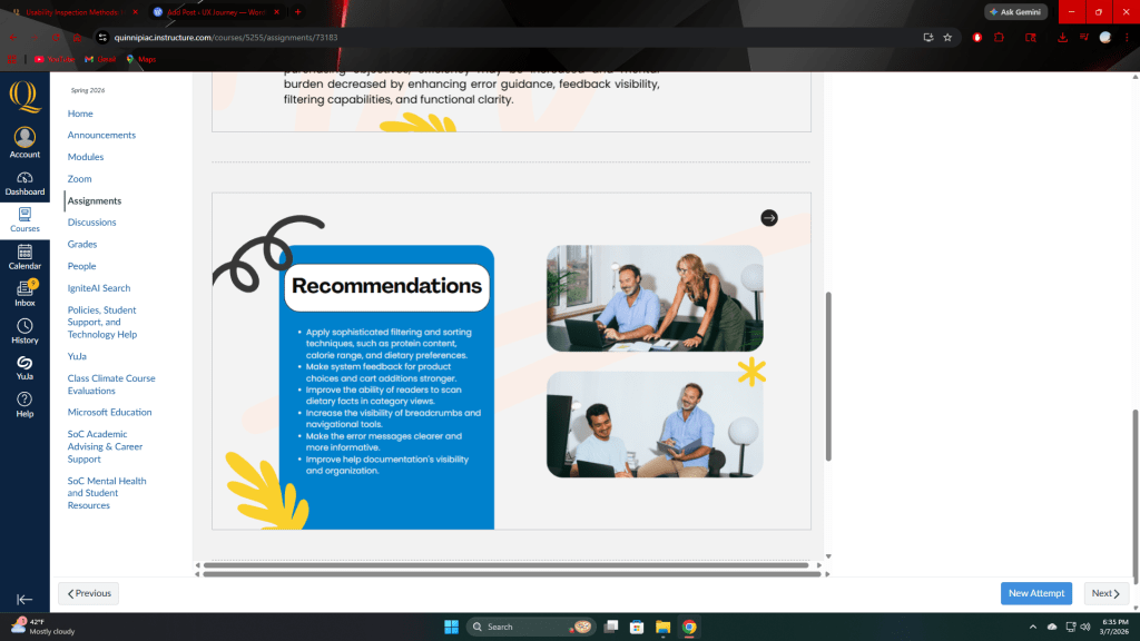
Recommended Improvements
The final report included a number of useful recommendations based on the research findings.
The goal of these suggestions is to maintain the current visual design while enhancing usefulness.
Introduce a Clear “Shop Now” Call-to-Action
A visible purchasing button would make it clear to customers how to make purchases right away. The process should be clear and simple to follow, even if transactions are eventually made through partner businesses.
Highlight Nutritional Information
Instead than being buried farther down on product pages, important nutritional information should be located close to the top.
Icons or brief summary labels could draw attention to details like:
- protein content
- calories
- sugar levels
This method facilitates quicker decision-making and scanning.
Add Product Comparison Tools
If consumers could compare flavors side by side, the process of exploring new products would be significantly improved.
This feature may display nutritional values and ingredients in an easy-to-compare grid.
Add Product Filters
With the help of filtering tools, users would be able to narrow down their options to suit their preferences.
The following are some possible filters:
- The amount of protein
- Calorie range
- Flavor types
- Nutritional aspects
This change would greatly improve the product browsing experience.
Why UX Research Matters
The fact that good design is more than just aesthetics is one of the project’s most significant lessons.
If a website does not match user expectations and habits, it may appear professional yet still cause friction.
The resources required to find those gaps are provided by UX research.
This project was able to go beyond presumptions and see actual user behavior through surveys, card sorting, interviews, diary studies, heuristic evaluations, and usability testing.
The ultimate product is a series of suggestions based on facts rather than conjecture.
Final Thoughts
The personality and vitality of the brand are already effectively communicated on the Barebells website. However, the entire consumer experience may be greatly improved by making the site more user-friendly.
The website should better meet user demands by introducing comparison tools, enhancing information visibility, and fortifying purchasing channels.
In the end, UX research aims to make digital interactions simpler, quicker, and more intuitive for users.
This project serves as an example of how methodical study might uncover workable solutions to that objective.