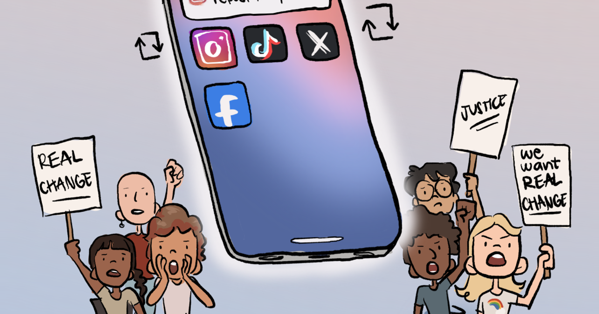
Social media is frequently blamed for propagating false information, promoting comparison, and fostering negativity. Although these worries are legitimate, they don’t tell the complete picture. Social media has great potential to spark change, build stronger communities, and motivate action worldwide when used wisely. It’s worth thinking about how these platforms may be utilized for good rather than only seeing them as sources of diversion or division, as well as why there is cause to be optimistic about their influence on society.
The potential of social media to amplify voices that may not be heard otherwise is one of its most potent features. In the past, the majority of the discussion in the public domain was dominated by big media corporations. People are now able to communicate their experiences, thoughts, and viewpoints to a worldwide audience. By bringing attention to vital problems and causes that require assistance, nonprofit groups, grassroots movements, and regular citizens may increase public awareness. This capacity to rapidly connect with millions of individuals may foster dialogue, teach communities, and promote significant change.
Additionally, during times of crisis, social media has proven to be helpful. Platforms enable the quick dissemination of information during natural disasters, humanitarian crises, and public health crises. Updates can be shared, relief activities can be coordinated, and others can be guided to reliable resources. Social media is frequently used to launch donation drives and fundraising initiatives, enabling people from all over the world to support recovery efforts. Digital connections often result in actual aid and cooperation.
Social media’s contribution to education and information dissemination is another positive feature. These platforms are frequently utilized by professionals, educators, and activists to clarify complicated subjects, share research, and make information more available to the general public. Social media has the potential to open the door to curiosity and lifelong learning, regardless of whether someone is studying science, history, health, or technology. It’s common for short videos, conversations, and threads to demystify complicated topics and encourage users to explore topics they wouldn’t have considered otherwise.
The sense of connection that social media may create is just as crucial. Online communities are frequently available to those facing similar challenges, such as bereavement, chronic disease, or mental health problems, where they may share their experiences and offer support. People are reminded by these networks that they are not alone and that help can come from unexpected sources.
In the end, social media mirrors the decisions made by its users. Although negativity can spread rapidly, so can kindness, empathy, and useful knowledge. Users can contribute to making social media a positive force by choosing to share insightful material, back worthwhile causes, and interact with others politely. There is cause for optimism: When people use these platforms to enlighten and uplift others, social media transcends mere entertainment and becomes a means of fostering awareness, connection, and good transformation.
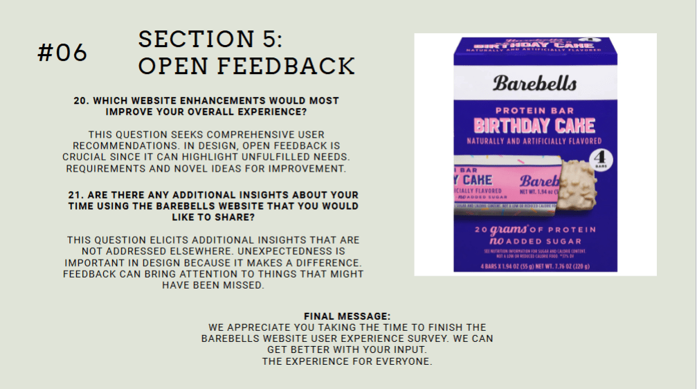
Research on user experience is most useful when it results in significant enhancements for actual users. The Barebells website had a thorough UX study during this project to see how well it serves users who are attempting to browse products, learn about nutrition, and eventually buy protein bars.
The final report is the result of several research techniques, such as structural analysis, usability testing, and user studies. This blog post describes the project from beginning to end, including the issue, the research techniques employed, the major findings, and the workable solutions that resulted.
Instead of just criticizing a website, the objective was to find practical ways to make it more user-friendly, effective, and in line with contemporary user expectations.
Project Background and Objectives
The Barebells website is as a marketing and educational center for the company’s range of protein bars and snack items. Product flavors, nutritional data, and the company’s brand narrative are highlighted on the website.
The website seems visually appealing and consistent with the brand at first glance. The whole design captures the vibrant personality associated with the Barebells brand, and the product imagery is engaging. excellent usability is not, however, a prerequisite for excellent visual design.
This project’s main objective was to respond to a crucial query:
How well does the Barebells website assist consumers who wish to research items and make judgments about what to buy?
A number of UX research techniques were used to examine the website from many angles in order to provide a response to that query.
Research Methods Used
This project’s usage of several complimentary UX research methods was one of its strong points. Different insights regarding how users engage with the site were provided by each method.
The research included:
Competitor analysis
Personas and user scenarios
User interviews
Online surveys
Card sorting exercises
Diary studies
Heuristic evaluation
Moderated usability testing
Using many approaches made it possible for patterns to recur in various datasets. When the same concerns surfaced in usability tests, surveys, and interviews, it was clear that those problems were actual usability issues rather than isolated viewpoints.
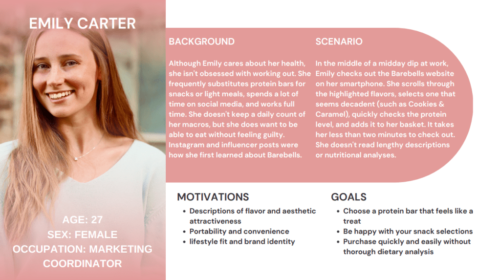
Understanding the Audience
The study concentrated on identifying the website’s target audience before assessing the design itself.
There were three main categories of users found:
The Fitness Enthusiast
To aid in training and recuperation, this user deliberately looks for foods high in protein. They give priority to nutritional data, including calories, sugar, and protein content.
The Health-Conscious Consumer
Before making a purchase, this customer thoroughly compares snack products and frequently assesses several brands.
The Casual Snack Buyer
This person is looking for quick snacks and may not be familiar with the Barebells brand.
Although the motivations and behaviors of each character varied, they all had the same need: easy access to clear product information and convenient ways to make purchases.
What the Research Revealed
A number of recurring topics surfaced from usability testing, surveys, and interviews.
The Barebells website is visually appealing, but it doesn’t always facilitate effective task completion.
A number of usability issues kept coming up.
Issue #1: Purchasing Is Not Clear or Direct
One of the most significant findings involved the purchasing process.
Participants in usability testing were instructed to figure out how to buy Barebells products. A prominent “Shop Now” button or the ability to add items straight to a shopping cart were anticipated by many users.
Rather, they came across a mechanism that steers them to outside merchants.
Confusion resulted from this design decision. Participants frequently stopped, looked through the navigation menu, or thought they might have overlooked something.
A discrepancy between user expectations and system behavior is shown in this problem. Consumers today are used to brand websites serving as e-commerce platforms.
The user experience is less effective when the purchasing process is indirect.
Issue #2: Nutritional Information Is Harder to Scan Than It Should Be
Another significant discovery concerned the presentation of nutritional data.
The nutritional value of protein bars is a common factor in purchasing decisions. Because of this, people want to be able to rapidly determine information like calories, sugar content, and protein levels.
The Barebells website has this information, but it isn’t given any visual priority. In order to find it, users frequently had to scroll through product pages.
Task completion was hindered by participants’ frequent pauses to look up nutritional information during usability testing.
An essential UX principle is brought to light by this problem: consumers scan before they read. The experience is less effective if important information is not immediately apparent.
Issue #3: Comparing Products Requires Too Much Effort
Comparing products presented another difficulty.
Participants had to access various pages and manually switch between them in order to compare two different flavors. Users had to navigate through several pages and retain information during this process.
The decision-making process becomes more cognitively taxing in the absence of a side-by-side comparison tool or filtering mechanism.
This design causes needless friction for users experimenting with different flavors.
Issue #4: Navigation Emphasizes Branding Over Tasks
Exercises involving the sorting of cards provided an intriguing glimpse into how people arrange information.
Content was typically grouped by participants based on tasks like:
Locating nutritional data
Investigating tastes
Buying goods
However, task-oriented navigation is not as important as brand storytelling and marketing material in the present site structure.
While brand narrative is important, navigation that puts an emphasis on product comparison and discovery is more beneficial for users who come to the website mainly to browse products.
Strengths of the Website
The study also identified a number of advantages of the Barebells website.
The website illustrates:
Powerful visual branding
Attractive product photography
Uniform design language
Unambiguous brand messaging
These advantages offer a strong basis for development. The redesign recommendations aim to improve user interaction with the content rather than altering the brand identity.
Recommended Improvements
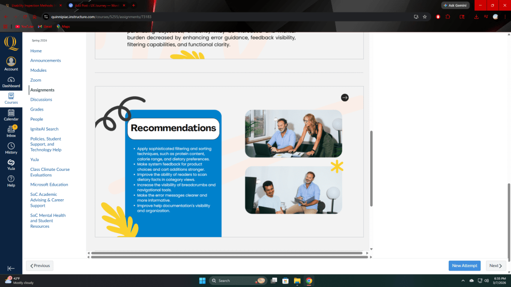
The final report included a number of useful recommendations based on the research findings.
The goal of these suggestions is to maintain the current visual design while enhancing usefulness.
Introduce a Clear “Shop Now” Call-to-Action
A visible purchasing button would make it clear to customers how to make purchases right away. The process should be clear and simple to follow, even if transactions are eventually made through partner businesses.
Highlight Nutritional Information
Instead than being buried farther down on product pages, important nutritional information should be located close to the top.
Icons or brief summary labels could draw attention to details like:
protein content
calories
sugar levels
This method facilitates quicker decision-making and scanning.
Add Product Comparison Tools
If consumers could compare flavors side by side, the process of exploring new products would be significantly improved.
This feature may display nutritional values and ingredients in an easy-to-compare grid.
Add Product Filters
With the help of filtering tools, users would be able to narrow down their options to suit their preferences.
The following are some possible filters:
The amount of protein
Calorie range
Flavor types
Nutritional aspects
This change would greatly improve the product browsing experience.
Why UX Research Matters
The fact that good design is more than just aesthetics is one of the project’s most significant lessons.
If a website does not match user expectations and habits, it may appear professional yet still cause friction.
The resources required to find those gaps are provided by UX research.
This project was able to go beyond presumptions and see actual user behavior through surveys, card sorting, interviews, diary studies, heuristic evaluations, and usability testing.
The ultimate product is a series of suggestions based on facts rather than conjecture.
Final Thoughts
The personality and vitality of the brand are already effectively communicated on the Barebells website. However, the entire consumer experience may be greatly improved by making the site more user-friendly.
The website should better meet user demands by introducing comparison tools, enhancing information visibility, and fortifying purchasing channels.
In the end, UX research aims to make digital interactions simpler, quicker, and more intuitive for users.
This project serves as an example of how methodical study might uncover workable solutions to that objective.
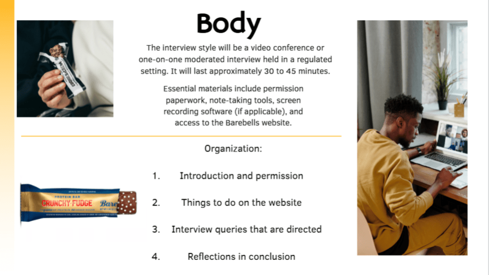
Assumptions come into contact with reality during usability testing. This moderated usability testing session was a crucial check point after a semester of studying and reviewing the Barebells website. What is the real user experience of the site?
The testing methodology, participant behavior, results, and what the data show about usability strengths and pain points are all covered in this article.
Study Purpose
The usability test aimed to assess how easily users could accomplish the following tasks:
Find information about the product.
Name specific dietary information
Look for ways to purchase.
Compare tastes
Learn about the company
The session was guided by the main research question:
On the Barebells website, how effectively may users accomplish everyday product-related activities?
Methodology
This was a monitored remote usability experiment, not a card sort or survey.
Structure
3 participants
Five practical assignments
Think-aloud approach
Recording the screen with zoom
25 to 35 minutes each session
The reminder to participants was:
“We are testing the website, not you.“
In order to replicate real usage circumstances, each participant utilized their own browser and laptop in a comfortable home environment.
Participant Profiles
Participant 1
22 years old
High computer literacy
Familiar with Barebells
Participant 2
28 years old
High computer literacy
Limited brand familiarity
Participant 3
35 years old
Moderate computer literacy
No prior exposure to the brand
This mix provided insights from both experienced and first-time users.
Tasks Given
The participants were asked to finish five main assignments:
Locate the dietary facts for a protein bar
Find out where to buy Barebells products
Determine if bars have extra sugar.
Compare two separate tastes
Locate details about the business (About page)
Key Findings
1. Purchasing Flow Created the Most Friction
This was the most difficult and time-consuming job.
Participants expected:
A button that says “Shop Now“
Straightforward online checkout
A system that adds items to the shopping cart
Instead, they came upon:
Redirects by retailers
Finding stores via navigation
Indirect methods of purchase
According to one of the participants:
“I thought I would just add it to a cart.”
Insight: Today’s users expect that food brand websites operate as complete e-commerce platforms. Cognitive dissonance rises when that expectation is not fulfilled.
2. Nutritional Information Was Not Immediately Visible
All participants eventually found the nutritional information, but:
It required scrolling
It was not visually emphasized
It was embedded within product detail sections
First-time users took significantly longer to locate this information.
Insight: Users scan before reading. If critical information is not visually prioritized, efficiency decreases.
3. No Flavor Comparison Tool Increased Cognitive Load
Participants switched between two flavor pages manually when requested to make a comparison.
Notable behaviors included:
Alternating between browser tabs
Scrolling back and forth
Expressing frustration verbally
In the absence of a side-by-side comparison tool, users depended on their memory to evaluate protein content and calories.
Insight: Relying on memory for comparison heightens cognitive load and delays decision-making.
4. The About Page Performed Well
This was the quickest task that was finished.
Participants noted:
Navigation labels were easy to understand
The positioning felt logical
The brand story was readily available
This indicates that the overall navigation structure is fairly robust.
Quantitative Observations
The task with the longest average duration is:
Locating purchasing options
The task with the shortest average duration is:
Identifying the About page
Users who were less familiar with the brand consistently required more time for all tasks related to products.
Identified Problem Areas
The primary call-to-action for purchasing is lacking strength
The buying process is primarily focused on retailers
The nutritional information does not have an effective visual hierarchy
There is no option for comparing flavors
The filtering or sorting tools are quite limited
Recommendations
According to the results, the subsequent enhancements are suggested:
Add a Strong “Shop Now” Call-to-Action
Notable positioning at the top of the page to influence buying decisions.
Improve Nutritional Visibility
Include summary icons (e.g., No Added Sugar, High Protein)
Show nutritional highlights close to product titles
Introduce a Comparison Tool
Enable users to choose several flavors and analyze them side by side.
Implement Filtering Options
Sort by:
Amount of protein
Total calories
Dietary limitations
What This Testing Session Revealed
The usability session highlighted a key concept:
Strong visual design does not necessarily lead to efficient task completion.
While the Barebells website maintains visual coherence and adheres to brand principles, users experience difficulties when their expectations for direct e-commerce features clash with the retailer-focused shopping model.
From this experience, I realized that usability issues often stem not from design but from discrepancies in user expectations.
Moderated usability testing offers insights that analytics alone fail to provide. Observing users pause, scroll multiple times, or express confusion exposes friction in ways that metrics cannot.
Final Takeaway
The Barebells website excels in brand representation and fundamental navigation. Nevertheless, enhancing task completion—particularly for purchases and product comparisons—would greatly enhance the user experience overall.
Usability testing not only uncovers issues but also highlights opportunities.
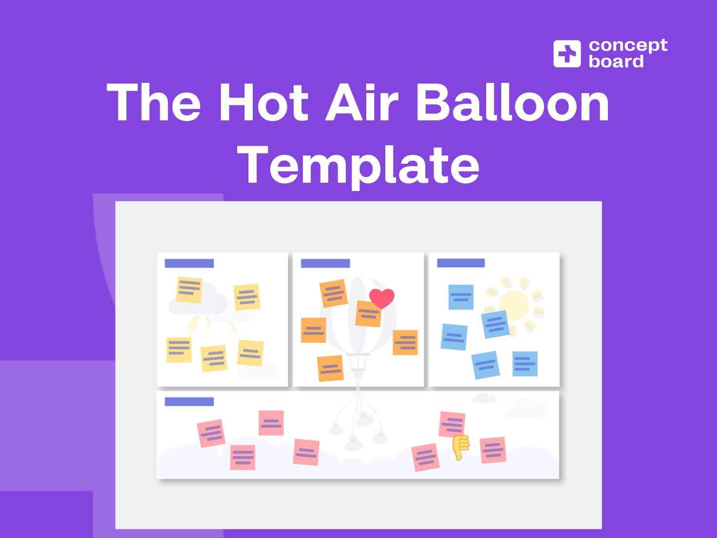
The collaborative workshop approach used by the hot air balloon UX design approach is used to determine the factors that support or obstruct a product, service, or experience. By picturing progress as a hot air balloon ascending into the sky, teams can identify both positive factors (wind and lift) and negative limitations (weights and anchors). Particularly during the early stages of design, retrospective evaluations, and strategic planning meetings, the approach works well.
Teams may better concentrate on priorities and identify hidden usability difficulties thanks to this method, which turns abstract feedback into a tangible visual representation.
What Is the Hot Air Balloon Method?
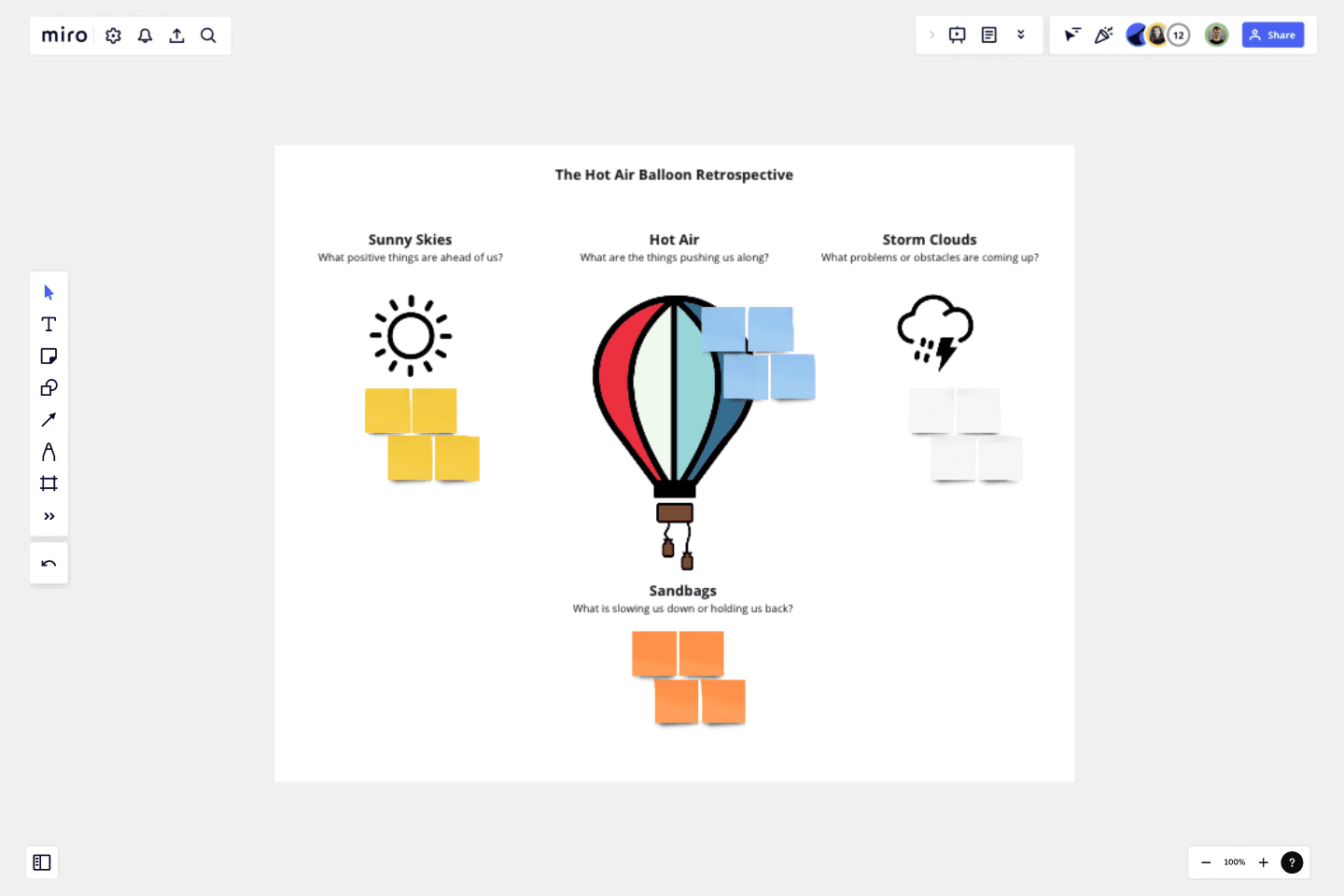
The hot air balloon approach is a visual brainstorming technique in which participants picture a product or project as a balloon trying to ascend. Enablers are the factors that cause the balloon to rise, while barriers are the factors that keep it from rising.
The approach promotes organized thinking about:
Things that help you achieve success faster
Flaws that impede advancement
Outside prospects
Internal restrictions
It encourages creative thought and less defensiveness during criticism sessions since it is metaphor-based.
How to Execute the Method: Step-by-Step Instructions
Step 1: Prepare the Visual Framework
Draw or show a big diagram of a hot air balloon that is divided into sections:
Balloon (goals and wishes)
Wind or flames (driving forces)
Sandbags or anchors (barriers)
Destination or the sky (desired results)
This shared visual anchor helps to establish a common language and promotes group alignment.
Step 2: Define the Focus Question
Create a straightforward research question, such as:
With the product, what helps users accomplish their objectives?
What gets in the way of easy communication?
Brainstorming stays relevant and practical when it’s centered on a specific question.
Step 3: Individual Idea Generation
Ideas are written on sticky notes or digital cards by the participants:
The balloon or wind is surrounded by positive forces
The weights or anchors are surrounded by negative forces
Groupthink is lessened, and a range of opinions are solicited, by silent ideation.
Step 4: Group Discussion and Clustering
The group organizes related topics and analyzes its notes. Participants expand on important ideas and explain their reasoning.
The debate brings out common trends and clears up unclear feedback.
Step 5: Prioritization
The most important drivers and impediments are chosen by team voting. High-priority things are now targets for action.
Brainstorming becomes a roadmap for improvement via prioritization.
Step 6: Action Planning
Convert top insights into design suggestions or experiments.
This action guarantees that workshop results will result in real change.
Tools That Support the Method
The hot air balloon workshop may be facilitated by a variety of physical and digital resources.
Physical Tools
Markers and whiteboards
Sticky notes
Big printed balloon templates
These tools are effective for collaborative in-person meetings.
Digital Tools
For interactive whiteboarding, use Miro
Figma for templates for structured diagrams
A mural for online courses
Digital platforms allow dispersed teams to collaborate synchronously and retain artifacts for future study.
Research Applications and Case Studies
The hot air balloon approach has been employed in research and design practice as well, even if it is frequently used in industry workshops.
Study 1: Collaborative Ideation in UX Workshops
The efficacy of metaphor-based ideation tools in UX workshops was documented by researchers affiliated with the Nielsen Norman Group. Their results showed that visual metaphors, such the hot air balloon, enhanced participant involvement and produced a wider range of design ideas than conventional discussion formats. Visual frameworks led to more defined action items and greater agreement amongst teams.
Study 2: Participatory Design in Educational Technology
The hot air balloon technique was utilized in a participatory design project headed by a university to test an educational platform. Participants, including students and teachers, identified learning enablers and obstacles. The technique revealed discrepancies between user expectations and system capabilities. Later revisions raised user happiness and task completion rates.
Study 3: Innovation Workshops in Product Design
The hot air balloon approach was integrated into innovation workshops by design teams who drew inspiration from IDEO’s popular methods. According to internal reviews, teams employing the framework were able to recognize systemic impediments earlier in the design cycle, which resulted in less rework and a faster iteration rate.
Advantages of the Hot Air Balloon Method
Promotes a fair discussion of both the advantages and disadvantages
Gives abstract concepts a tangible form
Promotes inclusive participation
Generates actionable insights based on priority
Limitations to Consider
Possible to oversimplify complicated systems
Depends on well facilitated interaction
May give more weight to perception than measurable facts
When to Use This Method
The hot air balloon UX design method is particularly useful when:
Early prototype evaluation
Carrying out a retrospective reviews of products
Bringing stakeholders together around a plan
Organizing workshops that cross disciplines
Its power comes from turning disparate input into a cohesive visual narrative that informs decision-making.
Conclusion
The hot air balloon approach is a potent and approachable UX design strategy that combines imagination and organization. Teams develop a common understanding of priorities and opportunities by visualizing the forces that either lift or weigh down a product experience. The approach turns into a useful engine for ongoing improvement when combined with smart facilitation and the right digital technologies.
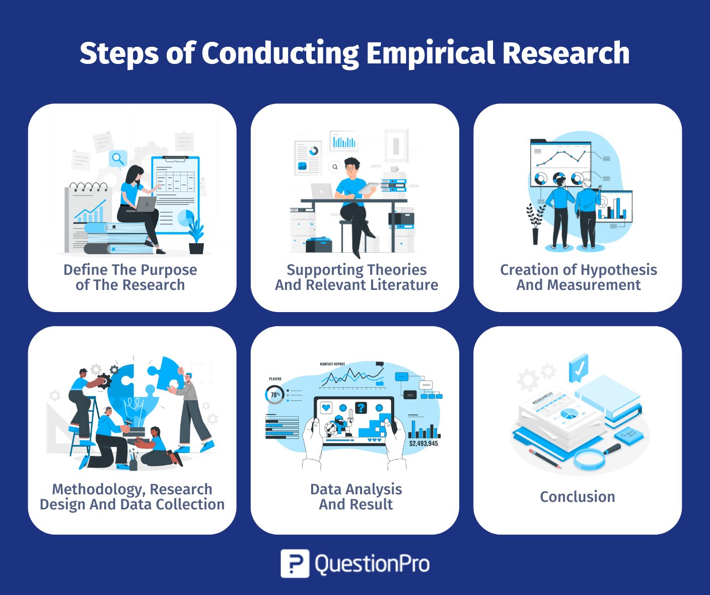
Stories are a favorite of product teams. We discuss intended workflows, personas, and user journeys. However, intent is a poor indication of how well real goods may be improved. The most important thing is to empirically measure how people utilize a product—by methodically observing, documenting, and analyzing how they truly interact with it in the real world.
Product choices are shifted away from presumptions and toward data by empirical measurement. Instead of “we think users do X,” it says “we observed users doing X, Y, and sometimes Z.” The challenge is no longer about collecting data in an era of digital products that are rich in analytics; rather, it’s about figuring out what to measure, how to analyze it, and how to relate behavior to relevant results.
What Is Empirical Measurement of Product Usage?
Empirical measurement involves collecting data that can be seen and measured based on actual user behavior rather than only relying on opinions, forecasts, or self-reported views. This generally entails the following in product contexts:
The amount of time spent using it as well as how often it is used.
Embrace and forsake features.
Error rates and task completion.
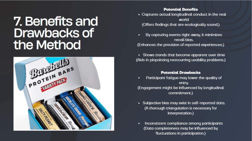
Longitudinal usage trends over time.
Empirical usage data, in contrast to interviews or surveys, records actual behavior: what users do under actual limitations and in real situations when no one is looking. Qualitative methods are not, however, unimportant. Instead, qualitative findings aid in explaining the behavioral foundation that empirical measurement offers.
Why Empirical Usage Measurement Matters
Teams can end up optimizing the wrong things if they base their decisions on anecdotal feedback or intuition. Empirical measurement aids product teams in:
Recognize areas of friction users might not express themselves.
Identify features that seem appealing on paper but are ineffective in reality.
Give preference to improvements that have a genuine effect rather than loud viewpoints.
Verify (or disprove) assumptions about the product.
Monitor how designs evolve over time and assess how different design options impact them.
In a nutshell, product development becomes a learning system rather than a guessing game thanks to empirical evidence.
Common Methods and Metrics
Event-Based Analytics
Amplitude, Mixpanel, Google Analytics, and similar tools monitor individual user behaviors, such as:
Clicks on buttons.
Features that are activated.
Submitting forms.
Errors or unsuccessful actions.
These incidents may be examined using funnels to identify user attrition points or using cohorts to compare behavior over time. An example metric is the percentage of users that finish onboarding during their initial session.
2. Session & Path Analysis
Path analysis and session recordings demonstrate how users navigate a product:
When they pause.
The place where they turn around.
When they leave unexpectedly.
This is particularly helpful for pinpointing discrepancies between the planned flow and the actual flow. An example metric is the most typical route taken before an account is given up.
3. Feature Adoption & Engagement Metrics
Not every feature is created equal. Empirical measurement helps answer:
Which features are really utilized?
Whom?
How frequently?
Weekly active use of a new collaboration feature by power users as opposed to casual users is an example of a metric.
Case Study 1: Rethinking a “Successful” Feature Launch
A popular dashboard functionality was introduced by a SaaS productivity business. The leadership deemed it a success, and the initial response was favorable. Nevertheless, empirical usage data showed a different picture.
What the figures revealed:
The feature was tried once by 68% of users.
Only 12% of respondents used it more than twice.
The majority of users found it by chance through navigation rather than on purpose.
Insight: The function addressed a theoretical issue, but it didn’t fit into the actual workflows of users.
Result: The team redesigned the feature to integrate into current task flows rather than segregating it in a separate dashboard. Following the redesign, repeat usage rose to 41%. The team could have kept investing in a feature that users silently ignored if there hadn’t been any empirical measurements.
Case Study 2: Observing Behavior vs. Asking Questions
A corporation involved in e-commerce sought to enhance its checkout procedure. User interviews revealed that the checkout process was “simple and intuitive.” However, conversion rates were still poor.
Empirical results:
Frequent switching between the payment and delivery screens was shown by session recordings.
Even when they didn’t have a promotional code, users would pause for the longest amount of time while entering it.

Mobile device error rates increased.
Insight: Cognitive friction at decision points, rather than perceived complexity, was the issue.
Outcome: The team enhanced the checkout process, eliminated the promo code field until later in the transaction, and enhanced mobile error handling. Conversion rates increased by 14%. A significant benefit of empirical measurement is demonstrated by this case: users are frequently unable to articulate their own actions.
Making Empirical Data Actionable
It is simple to gather information about use. It’s more difficult to make it useful. Teams that are productive:
Connect measures to specific product inquiries.
Stay away from vanity indicators like raw clicks without context.
Mix quantitative data with qualitative follow-ups.
As products evolve, revisit measurements frequently.
They consider empirical measurement to be a continuous investigation, not just a one-time verification procedure, which is its most important aspect.
Conclusion: Designing for Reality, Not Assumptions
The basis of product design and strategy is the real world, as determined by empirical data. It demonstrates where products fall short in providing value, as well as what consumers choose to prioritize and what they choose to avoid. Behavioral data offers a crucial counterbalance to presumptions, tastes, and internal narratives, even though no single dataset tells the complete story.
The teams that prevail in a cutthroat product environment are those that are most receptive to learning from what users actually do, not those with the strongest viewpoints.
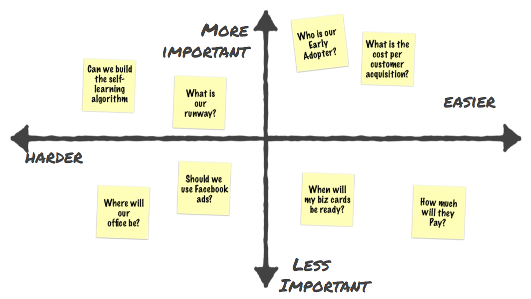
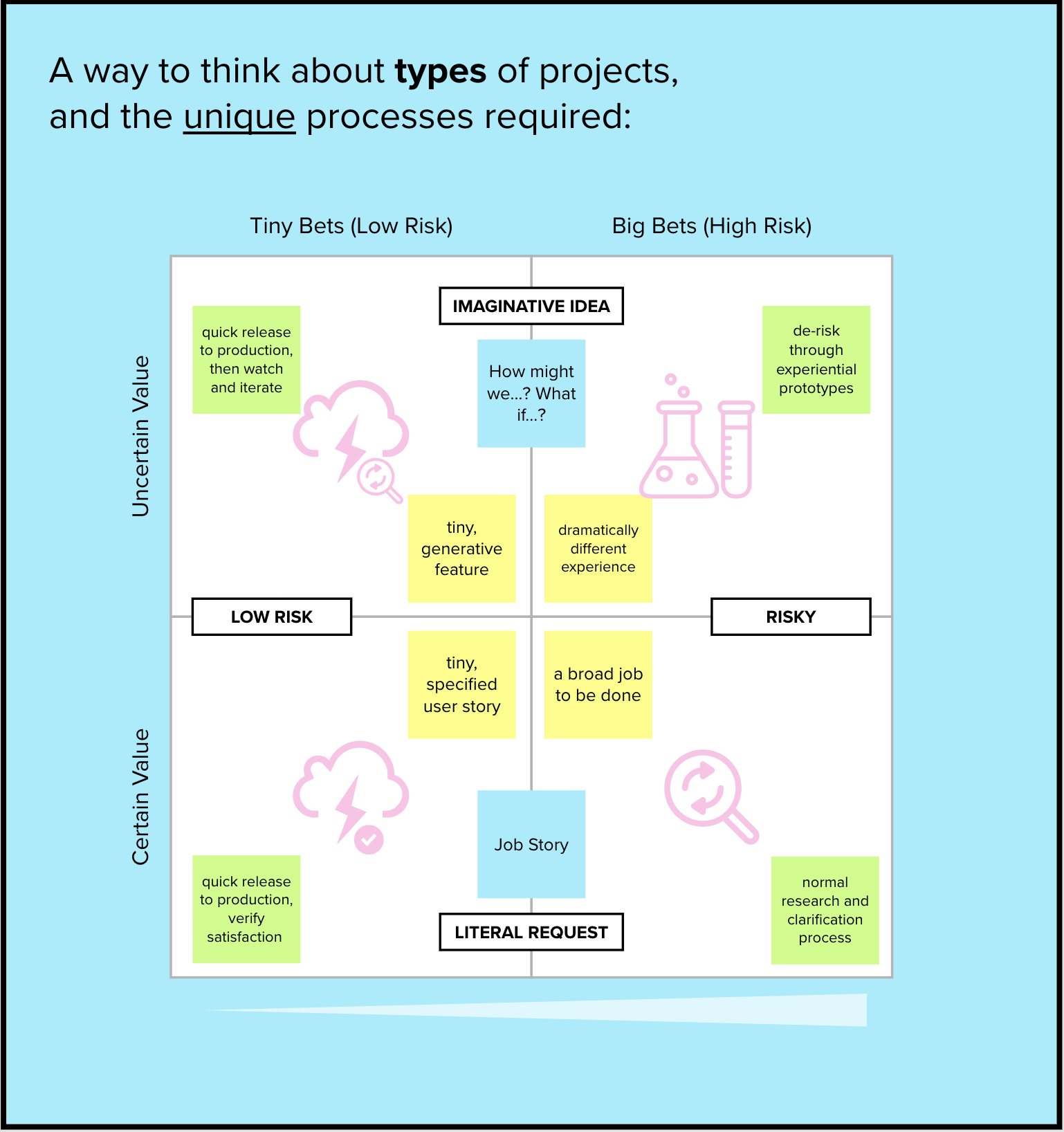
Teams frequently have trouble making choices with clarity and alignment in the fields of product strategy and user experience (UX) design. What criteria do you use to determine the relative importance of different features? What are the most pressing requirements of the users? What are the most important problems? The 2×2 Matrix approach, which is simple, organized, and quite visual, aids UX professionals in making well-considered judgments and expressing them in a clear manner.
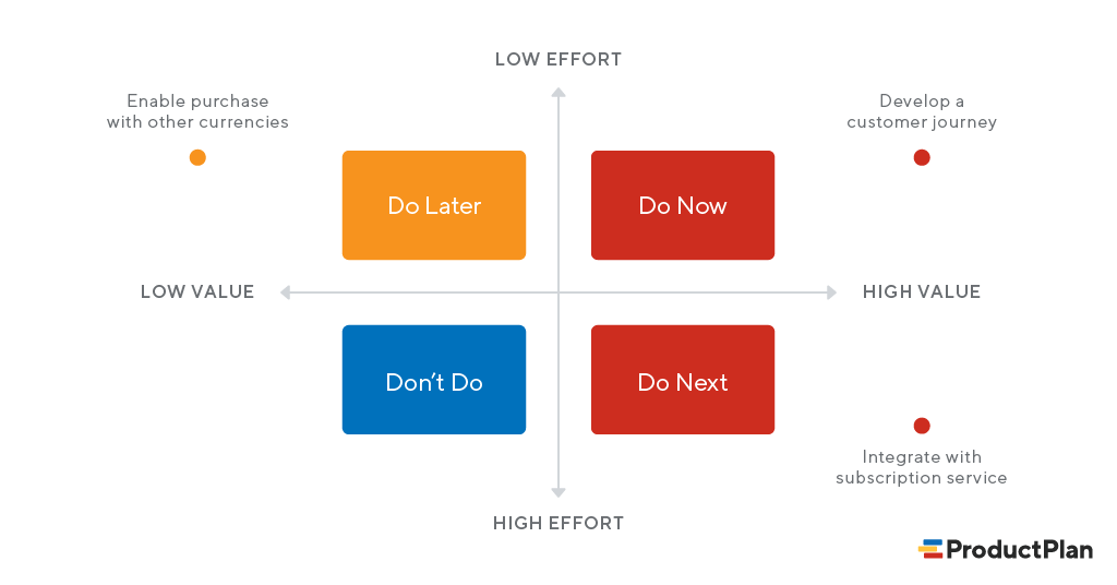
A 2×2 matrix is, at its foundation, a grid with two axes, each of which represents a different dimension that is important to your issue. Based on where things are located along these axes, the grid splits material into four quadrants. Prioritization, strategic planning, feature scoping, and customer segmentation are typical applications in UX. Items are placed in the quadrants, which provides insight into patterns and guides decision-making.
Because it immediately clarifies trade-offs, helps visualize complexity so teams may reason together, brings stakeholders in line with decisions, and aids in facilitation during workshops or planning sessions, UX designers utilize it. It’s especially helpful when it comes to balancing conflicting viewpoints, like business objectives, user requirements, and technological limitations.

Here is a straightforward six-step procedure for utilizing the 2×2 matrix:
Determine Your Objective
Begin by posing a specific question that you want answered. For instance: “Which features should we develop in the upcoming quarter?”
Select Your Axes
Choose two aspects that will aid in your assessment of products. A typical illustration:
Value to users along the y-axis (Low → High)
Effort to implement (Low to High) on the X-axis
Use independent dimensions, and make sure the meaning of the axes does not overlap.
Make a list of your belongings.
Collect the things you want to evaluate, such as potential features, research possibilities, usability challenges, and so on.
Put the things on the grid.
As a group, decide where each piece belongs among the four quadrants:
Low effort, high effort Major Projects, High Value, Quick Wins Time wasters with little value
Examine Quadrants
The meaning of each quadrant is as follows:
Rapid Wins: high worth, little effort → Prioritize this.
Key Projects: High Value, High Effort → Make a careful plan
Fill-Ins: Low effort, low value → It’s good to do.
Time Wasters: High effort, little worth → Avoid/Postpone
Choose and Take Action
Use the matrix as the foundation for prioritization and alignment. Record choices and future actions.


Depending on your workflow and team, you may use a variety of tools to make 2×2 matrices:
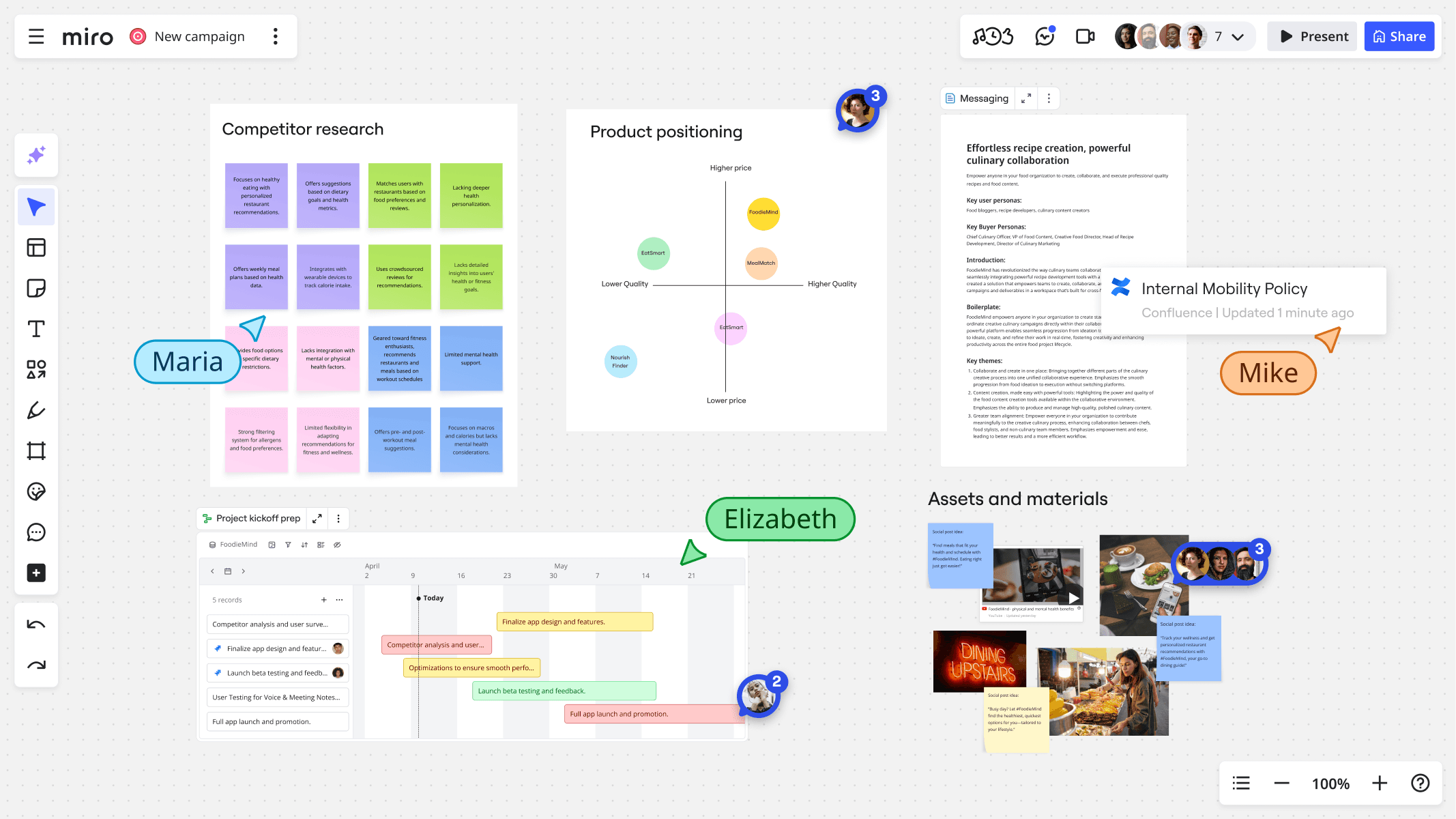
Whiteboards for the Internet
Ideal for real-time workshops and collaboration:
Miro
Mural
FigJam
With these, teams may iterate, vote, comment, and drag and drop sticky notes into quadrants.
Tools for Planning and Productivity
Ideal for documentation and roadmap integration:
Notion
Trello
Airtable
You can include snapshots or matrices into your larger strategy pages.
Instruments for Design
To communicate polished visuals with stakeholders:
Figma
Sketch
Adobe XD
Designers have the ability to integrate artifacts directly into UX deliverables and create unique matrices.
Spreadsheets
Easy to use and simple:
Google Sheets
Microsoft Excel
Use cells to symbolize objects after just naming two axes.
The 2×2 matrix itself is not a topic of psychological investigation, but it is frequently cited in studies of UX and decision-making. The matrix has a role in the following examples taken from the academic and practical literature:
Prioritization of Features in Agile UX
In a 2020 publication of the Journal of Systems and Software, the authors examined how agile teams prioritize features. Compared to ad-hoc prioritization, the study discovered that teams that used structured prioritization tools, such as 2×2 matrices with Value vs. Effort, made more consistent choices and had considerably better alignment between UX, business, and engineering stakeholders. The transparency and conflict were reduced by the use of structured matrices. (Journal of Systems and Software, 2020)
Making Decisions in the Face of Uncertainty
As part of decision framing methodologies, researchers researching product teams in Information and Software Technology (2018) employed a variation of the 2×2 matrix. Teams that visually externalized criteria, such as risk and confidence axes, were more adept at spotting underlying biases and mitigating bias. Cognitive aids were provided by visual matrices. (Information and Software Technology, 2018)
Evaluation of the Severity of Usability Issues
Using a quadrant model to categorize usability concerns by Severity vs. Frequency, a 2019 research in Behavior & Information Technology examined usability from the standpoint of a usability evaluation. According to the matrix, certain high-severity problems occurred rarely and were mistakenly de-prioritized, causing teams to rethink trade-offs. The quadrant approach helped to strike a balance between impact and prevalence. (Behavior and Information Technology, 2019)
The 2×2 matrix is a straightforward but effective UX technique for helping people make difficult choices. The matrix helps teams see trade-offs, make aligned judgments, and take action with certainty, whether they are prioritizing features, planning research, or categorizing insights.
Give it a go during your next design sync, and see how clarity takes the place of perplexity
You don’t need more content. You need better thinking.
I just published a piece on Medium that explores how people actually read, process, and feel design — not in theory, but in practice. It’s about the quiet psychology behind attention, clarity, and why some messages land while others disappear.
This article isn’t long. But it might change how you see your own work.
If you’re building, designing, writing, or communicating — it’s most definitely right up your alley!
1. LinkedIn
Most communication fails for one simple reason: It talks at people instead of with them.
I published a new Medium article exploring how people actually process messages, visuals, and ideas — and why clarity beats cleverness every time.
If you work in communications, design, or branding, you’ll appreciate this one.
I aimed to reach professionals, recruiters, hiring managers, thought leaders, and peers in communications/design with this LinkedIn post. LinkedIn rewards credibility and insight. The caption positions the article as professional value rather than casual reading. The image concept focuses on workspaces and thinking moments to visually match LinkedIn’s professional tone. An authority driven opening line with a light use of hashtags are also a huge plus.
2. Facebook / Instagram
You scroll past hundreds of messages a day. Only a few ever stick.
I wrote about why — and how design, psychology, and perception shape what we actually notice and remember.
If you’ve ever wondered why some ideas land and others don’t, then this article is for you.
The full piece is on Medium, link in bio.
For the Facebook/Instagram approach, I targeted a general creative audience — students, designers, casual readers, content consumers. These platforms favor emotion, relatability, and curiosity over formal expertise. The tone is more reflective and personal. I wanted a more artistic and less corporate look, as this will have a higher chance at stopping a user from scrolling. The abstract and moody visuals can capture and retain the readers focus, along with short paragraphs and no heavy hashtags.
3. X (Twitter) / Threads
Most content fails because it’s loud — not clear.
I wrote about attention, design, and the psychology of why some messages stick.
Short article. Big shift in perspective.
Medium link in my bio!
Catching the attention of the fast-scrolling thinkers, creatives, tech/design Twitter, and idea-driven communities is the way to go on x (Twitter) or Threads. These platforms favor minimalism, punch, and speed, so short, strong sentences work best. High-contrast visuals and quote-style graphics also work best too in regards to the pictures in my tweet. It’s no fluff and all fire with a tone that’s drenched in curiosity!
Every day is made of tasks — endless, repeating, invisible. The work never stops, and neither does the world’s quiet beauty. Between the dishes, the emails, the errands, small joys wait for us: fleeting, ordinary, and completely life-saving. This is a story about noticing them, as well as about making the choice time and time again to noticing them despite the constant chores and responsibilities.
The day starts the same way.
The cluttered, hectic nature of our jobs quickly becomes suffocating. We struggle to handle the weight more and more with each passing day. It’s difficult to see the pretty parts of life when you’re surrounded with so much ugliness.
The future is bright and clear.
However, if we make more of an effort to observe the finer things that life has to offer regardless of our mood, we suddenly don’t feel like we can’t breathe. Vibrant colors pop out at us from multiple directions and the weather is calming, generously provided by mother nature.
Joy, elbowing its way in.
Even when we have our occasional bad and/or blah days, we get a glimpse of life’s beauty. Every storm will pass, and these are the world’s ways of reminding you of that fact.
A flicker of warmth.
On the happy, carefree days, we carry mountains of hope in our hearts and excitement for the future that lies ahead. Sometimes, less is more. We don’t always need exotic gifts or grand gestures to satisfy ourselves. Serotonin is all around you!
The fruits of our labor.
But of course, there’s nothing wrong with treating ourselves to finer, materialistic things in life every once in awhile! Our jobs may be boring and annoying to constantly work around, but they can provide the steady income needed to upgrade our ever growing and aging list of wants.
Loved ones make it all worth it.
Your friends, family, and significant others always make your journey worthwhile and something to look forward to! They make every new day an adventure, and showering them with gifts is a great way to make them feel appreciated and yourself satisfied!
Pets are the hilarious icing on the cake.
Our pets are always an added bonus, especially dogs! They’re funny, affectionate, and extremely loyal depending on the breed! Capturing these comical moments to look back on will never get old in the midst of our draining routines and cycles.
Beauty through the darkness.
Although friends, family, partners, and animals are great, sometimes you just need some alone time. Taking in the cool, crisp air as the city skyline shines bright could be exactly what you need to reset and recharge for the long days and road ahead.
For the majority of us, each day begins in the same manner. The darkness is sliced by the alarm. Unread messages, dirty dishes in the sink, and the approaching commute are all on the to-do list. The task begins before we even leave the house. The errands, emails, and monotonous work that keep everything functioning but seldom get recognized are the kinds of tasks that occupy a life without ever seeming like a accomplishment. We live in these cycles for a large portion of our lives. The grocery line moves slowly, the laundry falls, and the keyboard clicks. The passage of hours is marked by a string of movements that are almost identical. We don’t take pictures of this aspect of our lives. It doesn’t seem extraordinary. It’s hardly discernible. However, the majority of our days occur here, in this constant stream of duty.
However, if you pay attention, you can see something else: slight breaks in the pattern. A faint ray of morning sunlight shines over the kitchen floor. The cozy warmth of holding a cup in your palm. A neighbor waving from the other side of the street. Although these instances are fleeting and occasionally unintentional, they break you out of autopilot. They remind you that you are a person moving through a world that is constantly giving you little reasons to pause and consider, rather than just a machine performing tasks.
The contrasts intensify as the day goes on. The stress of the job—the exhausted eyes, the congested environment, the deadlines—is directly next to the respite moments: a joke shared between coworkers, the wind releasing a cluster of leaves, the solace of recognizable footsteps bringing one home. They do not negate one another. They live together. They always have.
These flashes of joy become apparent everywhere when you start paying attention. The everyday beauty that lasts regardless of how busy or worn out we may be—not the big events, not the milestones. A pet curling up at your feet. On the phone, a friend’s voice. The last bit of sunlight reaching across a space. These are not breaks from the monotony; they are a component of the same reality. They are what keeps you going through the grind. The job is still not done by the end of the day. Tomorrow, there will be more waiting. However, the little pleasures are still there, hidden between the chores, waiting to reappear. This photo essay examines that coexistence: the unrelenting tempo of daily work and the silent, frequently unnoticed events that give it purpose. The texture of a life spent in motion—work, joy, rest, repeat—rather than the spectacular highs or lows.
We must not overlook the fact that even on the most mundane days, something beautiful and human is always trying to reach us. This is something that is easy to forget while recording these events. All we need to do is observe.
In her insightful essay, Jill Swenson highlights a crucial yet frequently overlooked difference in writing: the distinction between writing for readers and writing for listeners. Any writer who ever reads aloud, speaks into a microphone, or gives their work in person can benefit from her knowledge.
The Core Distinction: Eye vs. Ear
Swenson first outlines the distinction clearly. We appeal to the intellect when we write for print because it is logical, linear, and visual. The reader is able to stop, reread, and consider. However, the objective changes when we create material for an audience that will be able to hear our words.
Our goal is to elicit experience, emotion, and feeling, not simply to communicate concepts. This difference is important. It affects our sentence construction, word selection, and overall message organization; it’s more than simply a stylistic adjustment.
Key Principles: Swenson’s ABCs
Among her most significant practical recommendations is the use of subject-verb-object structures and the avoidance of overly complicated clauses. Repetition and alliteration would be another, since spoken repetition helps readers “lock in” meaning while redundancy is boring on the page. The last piece of sensible advice from Swenson is to refrain from going into too much specifics. When there are too many details, a listener may become confused. Unlike print, where details add richness, it can become noise in conversation, according to Swenson.
Broader Implications: Beyond Author Events
There are numerous situations when writing for the ear is essential, according to Swenson, including sermons, lectures, storytelling, podcasts, radio programs, and even PowerPoint presentations. However, the ramifications extend beyond the realm of leadership and commerce. By using Swenson’s concepts in their writing, presenters, thought leaders, and executives may make their oral communication more memorable and persuasive.
In education, there are implications as well. Because their language will be more organic, educators or teachers who create lectures with the ear in mind will be able to maintain students’ attention for a longer period of time. Additionally, media has these implications. Podcasters, radio presenters, and storytellers gain a lot from this since their writing now focuses on the audience rather than just the words.
Critical Reflection: Why Swenson’s Advice Is Especially Timely
The ability to write for the ear is now more important than ever in a world where audio material is thriving, including live video, podcasts, audiobooks, and virtual speaking engagements. A great opportunity is missed by writers who only consider the printed page: the chance to influence how their message is received. Swenson’s guidance serves as a link between the traditional world of writing (books, print) and the vibrant world of oral performance. Her essay urges authors to be adaptable and versatile, reminding them that the most effective communicators are those who can express their ideas effectively, whether through the eye or the ear.
Although design is frequently defined as the intersection of creativity and problem-solving, it is now also the intersection of psychology, economics, and human behavior. Understanding why consumers select, click, purchase, or abandon a product is as important as knowing what they require, since products now compete on usability, motivation, and emotional resonance as well as functionality.
Behavioral economics comes into play here. Contrary to conventional economics, which posits that individuals act rationally, behavioral economics demonstrates that people are wonderfully, predictably irrational. We make use of shortcuts. We become overwhelmed. We put things off. Although we are driven by incentives, they are not always the ones you may think.
This is a map, not a mistake, for designers. We examine below how behavioral economics influences better, more intuitive design and why it’s becoming necessary knowledge for anyone creating contemporary goods and experiences.
Cognitive Biases can be Understood to Make Design More User-Friendly
“Meeting users where they are” is a common phrase used by designers. The location of this is revealed by behavioral economics. In order to make sense of complicated information, people employ mental shortcuts (heuristics). Examples of this include choice overload causing decision paralysis, anchoring affecting how people see price or value, loss aversion making people more aware of what they may lose than what they may gain, and present bias directing us toward immediate pleasure and away from long-term advantages.
By comprehending these forces, designers can create flows that lessen cognitive burden, highlight the important information, and simplify interfaces. For instance, a checkout screen with fewer fields is not only cleaner, but it also helps to combat decision exhaustion and choice overload. Behavior-centered design is the result of human-centered design.
Theory of Nudging Guides Users Without Compelling Them
“Nudging,” which Thaler and Sunstein made famous, refers to creating settings that subtly lead individuals toward making wiser choices without restricting their autonomy. There are nudges everywhere in digital goods. Some examples include using timely reminders to prevent abandonment, highlighting “recommended” or “most popular” choices, providing progress indicators to encourage completion, or selecting the proper default option (e.g., opting into email receipts).
A successful nudge respects the user’s autonomy rather than attempting to influence them. The design of a choice environment, on the other hand, acknowledges that it may either help or impede a user’s objectives. Nudges, when done ethically, can lower friction, foster good behaviors, or boost involvement in a way that feels organic rather than forceful.
Behavioral Design Fosters Motivation and Encourages Action.
One of the biggest challenges is motivating users, regardless of whether you’re developing a fitness app, a budgeting tool, or a learning platform. Behavioral economics demonstrates the mechanisms behind motivation—and its fragility. By dividing goals into smaller activities (reducing overwhelm), offering prompt feedback to satisfy the brain’s reward circuits, employing commitment devices to assist users in completing tasks, and utilizing social proof to alleviate uncertainty, designers can increase motivation.
Gamification is frequently misinterpreted as the addition of points and badges. In fact, it is a behavioral technique that transforms advancement into something that is apparent, meaningful, and emotionally fulfilling.
Conclusion: Behavioral Economics is Now an Essential Design Talent.
Design is no longer simply about creating aesthetically pleasing or useful objects. It’s about influencing behavior, recognizing the limitations of humans, and designing products that are consistent with people’s genuine thoughts and actions. Designers may utilize behavioral economics tools to create experiences that are intuitive, enjoyable, and supportive of improved decision-making by minimizing friction and maximizing engagement.
By accepting behavioral insights, designers can produce solutions that are truly helpful and intelligent, rather than ones that go against human nature. Behavioral economics is becoming a design imperative in a world of limitless options and limited attention.