By Nicholas Pagonis
The beginning of a digital product is exciting. You have ideas everywhere, possibilities seem endless, and there is no shortage of things you could create. The end is exciting too, because you can finally see the finished product. Week two of developing my UX Launch Kit reminded me that the middle is where things get much more complicated.
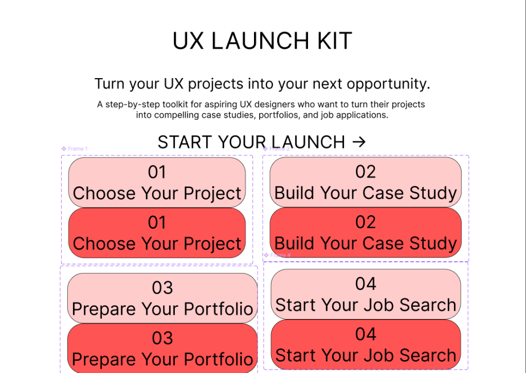
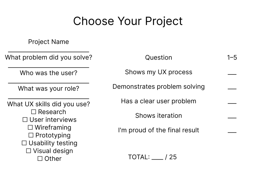
This week, I moved further away from planning and more into actually building the product. Instead of thinking about the UX Launch Kit as one large idea, I started breaking it into smaller pieces that could eventually work together. I focused on the core resources, including the case study framework, project selection process, portfolio checklist, and job search tools.
One of the biggest changes I made was shifting my focus from how many resources I could include to how clearly the product could guide someone through the process. My original instinct was to make the toolkit as comprehensive as possible. As development continued, I realized that more content does not automatically create more value. If a beginner opens the product and doesn’t know where to start, having more templates won’t solve the problem.
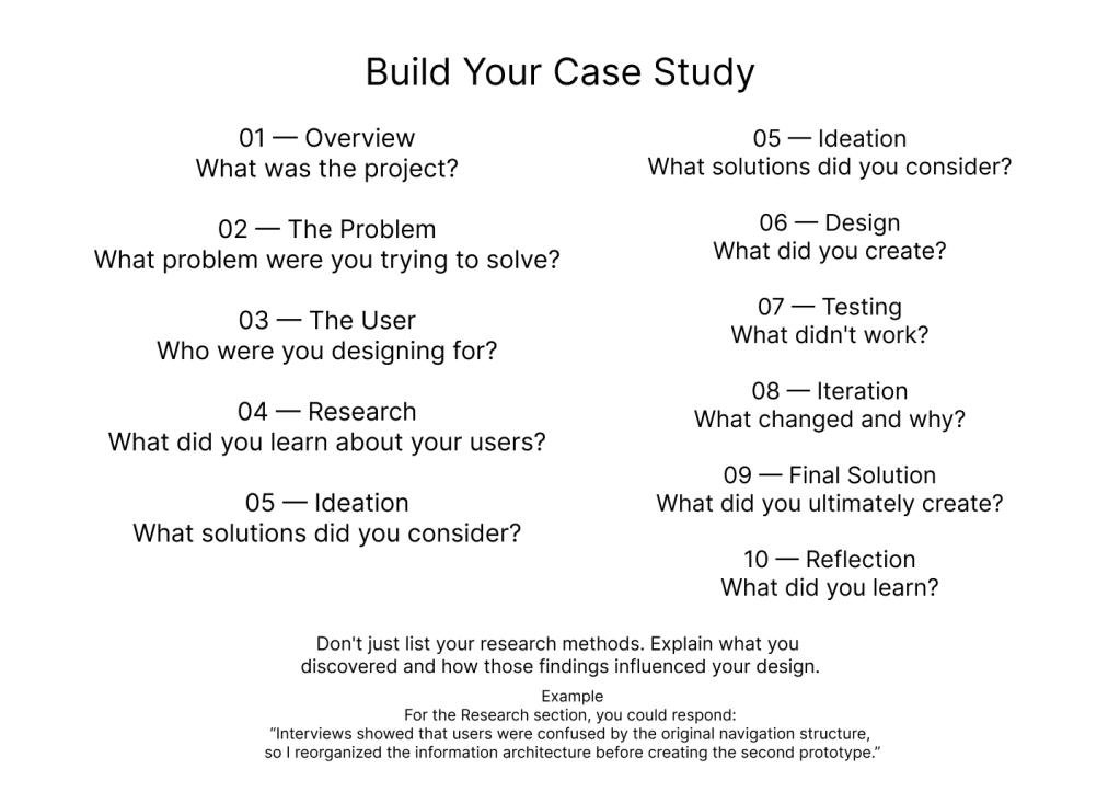
That led to an important pivot: the UX Launch Kit needs to feel more like a guided journey than a folder full of downloads. The experience should help users move from choosing a project, to developing a case study, to preparing their portfolio, and eventually to organizing their job search.
This also created an interesting challenge between quality and speed. Because the product has a limited development timeline, I could spend hours perfecting the appearance of one template, or I could continue building the rest of the product. I decided that getting the core structure completed was more important than making every individual piece perfect.
That doesn’t mean quality isn’t important. It means I’m learning to distinguish between polishing something and solving a problem. A visually impressive template isn’t useful if the instructions are confusing. A simple tracker can be more valuable if it makes the user’s next step obvious.
Researching existing UX resources also helped me work through these decisions. Exploring Notion’s template library gave me inspiration for organizing digital resources, while the Interaction Design Foundation provided useful UX and portfolio guidance. I also continued looking at the UX Portfolio Playbook to understand how more comprehensive UX career products structure their content.
The biggest lesson from week two is that development isn’t about constantly adding. Sometimes progress means simplifying, removing, and making a decision. The middle mile can be frustrating because the final product isn’t there yet, but every revision brings the concept closer to something that could actually help someone.
For week five, my goal is to finish connecting the core pieces, test the experience from a beginner’s perspective, and identify what needs to change before moving toward a more polished version.
 UX Journey
Leave a comment